Last updated on
Check out our farm sign designs that show how a well-built entrance sign can quietly tell your farm’s whole story.
Some entrances are just a way in. Others set the tone before a single boot hits the gravel. These farm signs grew out of our obsession with that first impression—how a few boards, some metal, and a good idea can tell the whole story of a place in one glance.
We were inspired by real working farms that deserve better than flimsy plywood and clip-art tractors. So you’ll see solid timber frames, honest metalwork, and silhouettes that read cleanly from the road, whether it’s livestock cutouts, tractors in motion, or full panoramic barn scenes.
If you’ve ever thought, “It’s just a sign,” these might change your mind a bit. After all, the cows may not care what the entrance looks like, but everyone else definitely does.
Backlit Rustic Livestock Silhouette Farm Sign
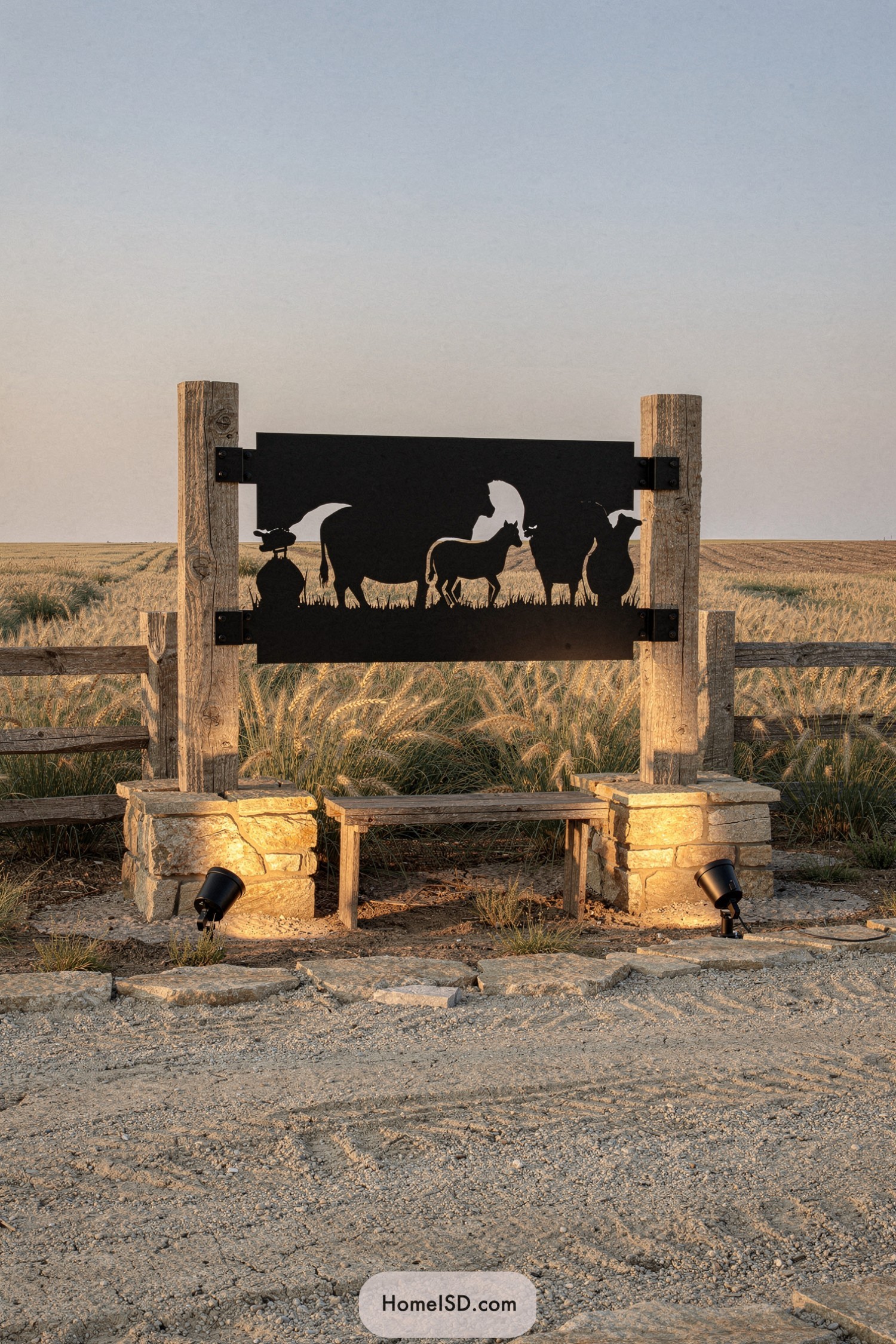
This sign pairs chunky timber posts with warm stone bases, creating a solid, almost gate-like frame for the sleek black steel panel. The cutout silhouettes of farm animals read crisp and clear against the open sky, turning a simple entry marker into a bit of outdoor wall art.
Discreet ground lights wash the stone and underside of the sign with a golden glow, so it looks just as striking at dusk as it does at noon—no batteries of fairy lights needed. The simple bench tucked between the bases softens the structure, suggesting a place to pause and admire the fields, giving the whole piece a welcoming, storybook-farm feel.
Contemporary Harvest Icon Gateway Sign
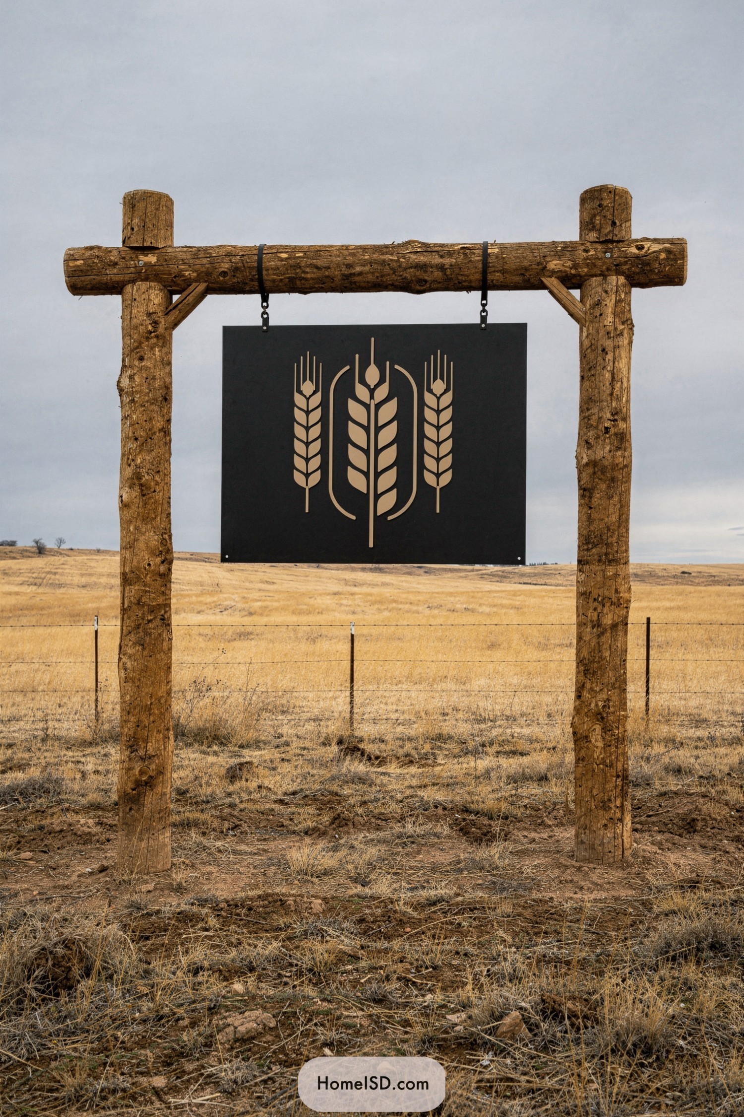
This design pairs a raw timber frame with a sleek black panel, letting the stylized wheat stalks take center stage. The clean lines of the emblem feel almost urban, which makes the weathered logs and open field backdrop look even more intentionally rustic—like the countryside got a graphic designer.
The wheat motif is inspired by classic grain elevator logos, but simplified into a modern crest that reads clearly from a distance. It’s the kind of sign that suggests the farm is both proud of its heritage and not afraid of a little branding flair, without drifting into anything fussy or overdone.
Weathered Timber Swinging Farm Emblem
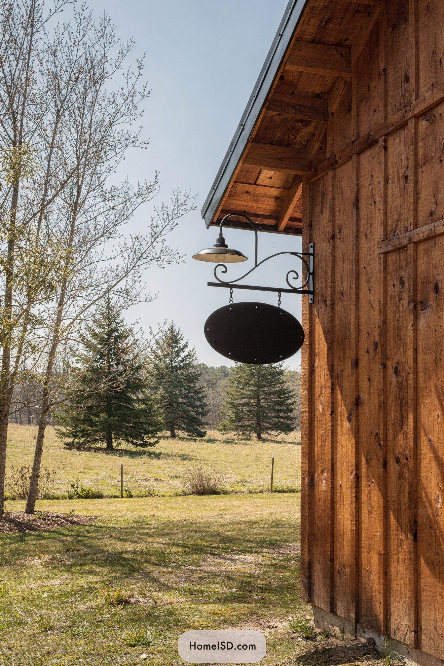
This hanging farm emblem pairs a smooth black oval with a scrolled iron bracket, creating a simple silhouette that feels both sturdy and a bit romantic. The warm, weathered barn siding behind it adds texture and depth, letting the dark shape read almost like a punctuation mark against the landscape.
The overhead gooseneck light is a subtle nod to old general stores, meant to wash the sign in a soft glow at night without stealing the show. The whole setup feels inspired by traditional country inns, but stripped down to clean lines and honest materials so it fits right into a working farm instead of looking overly fussy.
Country Club Inspired Farm Nameboard
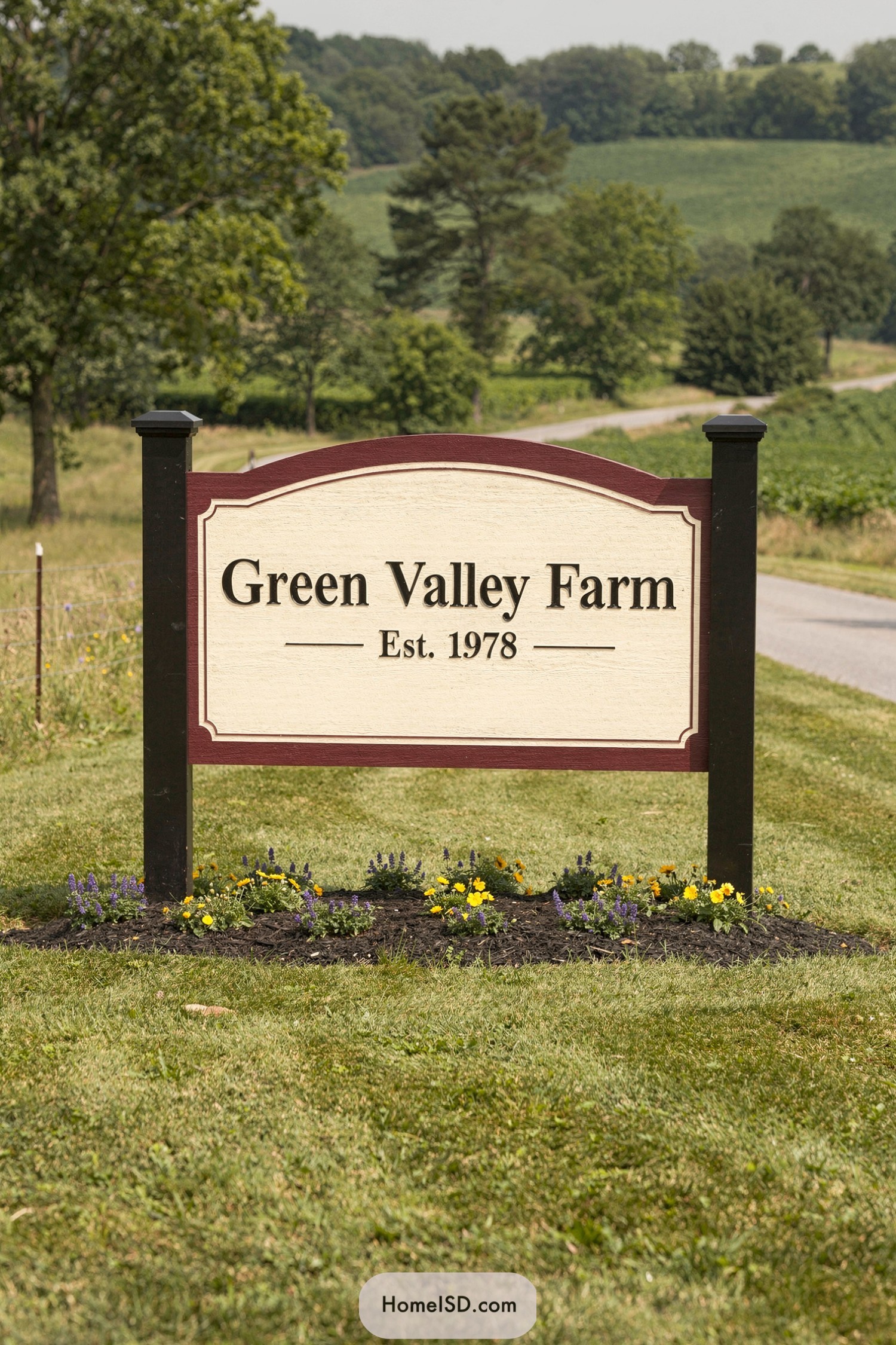
This sign leans into a classic country-club vibe, with its rich burgundy frame and gently arched top giving the farm name a touch of quiet prestige.
The cream background keeps the look light and readable, while the serif lettering and centered “Est. 1978” line feel timeless and confident rather than shouty.
Slim border insets and the subtle panel detailing add just enough ornament to feel special without tipping into fussy. Anchored by simple dark posts and a neat bed of colorful flowers, the whole piece looks like it was designed to say, “Yes, we work hard out here—but we also have our act stylishly together.”
Farmstead Scroll Trim Welcome Board
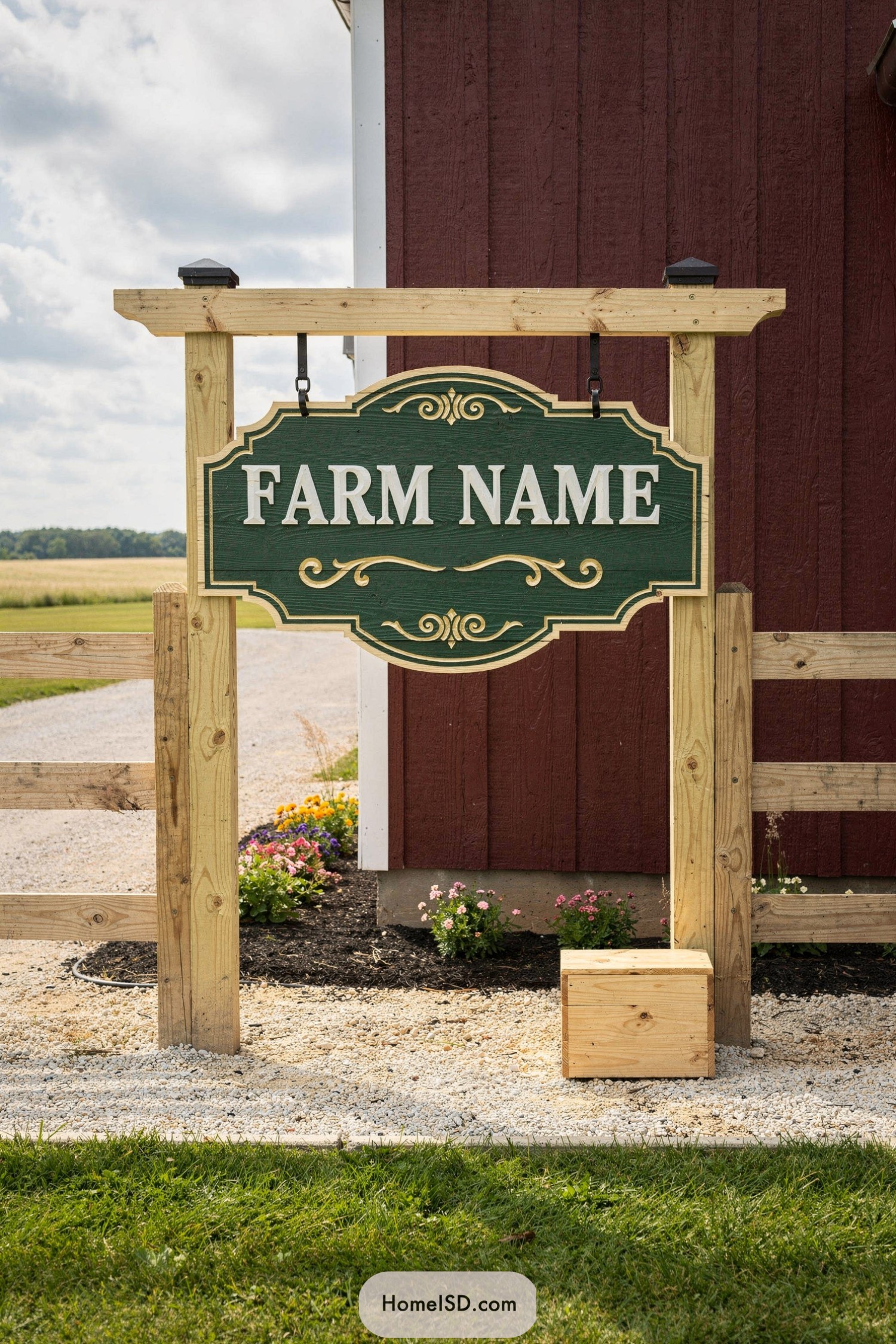
This hanging board leans into a classic country aesthetic, pairing a rich green background with creamy raised lettering and scroll accents that feel straight off a vintage inn. The ornate, curved silhouette softens all the straight lines around it, giving the entrance a touch of old-world charm without feeling fussy.
The simple timber frame is intentionally straightforward, letting the sign itself be the star while echoing the surrounding fence for a cohesive look. Black metal hangers add a subtle industrial note, so it feels sturdy and practical—as if to say, “Yes, I’m pretty, but I can handle a windy day.”
Minimalist Hanging Disc Field Sign
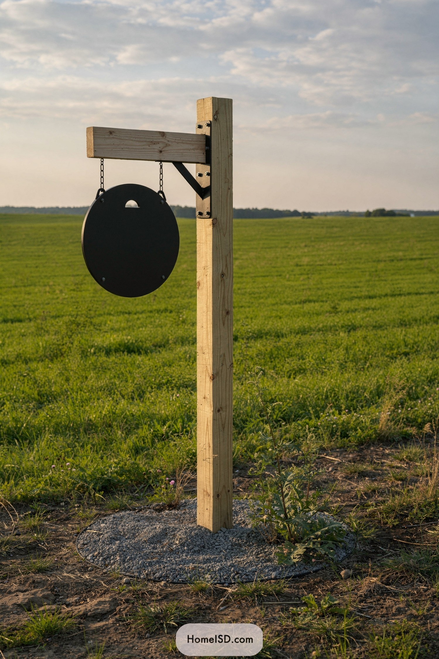
This sign leans into pure minimalism, pairing a clean round metal disc with a simple timber post so the landscape does most of the talking. The exposed bolts and slim black brackets add just enough industrial detail to keep it from feeling like a fence post with ambition.
The contrast between the pale, unfinished wood and the matte black circle feels modern yet still very at home in a rural setting. It’s the kind of design that looks inspired by old inn signs, then stripped down to the essentials so it works for a contemporary farm or homestead entrance.
Oval Lane Post Farm Gateway Sign
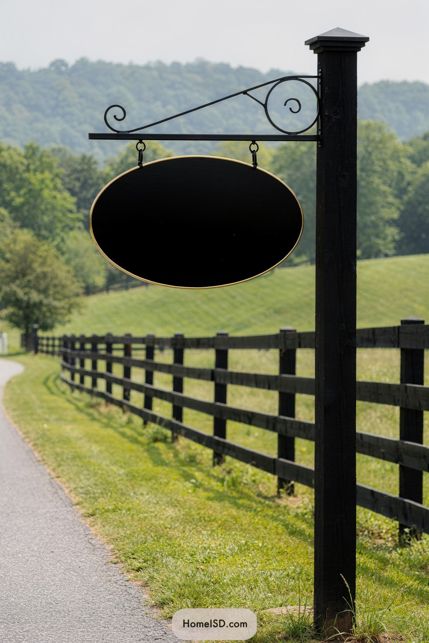
This hanging sign leans into a timeless, almost inn-like look, with its clean oval shape edged in a slim gold trim that feels quietly upscale. The matte black finish keeps it grounded and practical, letting the form do the talking instead of flashy colors trying to shout over the landscape.
The wrought-iron bracket brings in graceful scrolls and a subtle diagonal brace, giving the whole piece a touch of old-world charm without going full medieval tavern. Paired with the sturdy square post and the long fence line behind it, the design clearly pulls from classic country estates where the entry marker feels like part of the architecture, not just an afterthought stuck in the grass.
Sunwashed Plankway Roadside Farm Sign
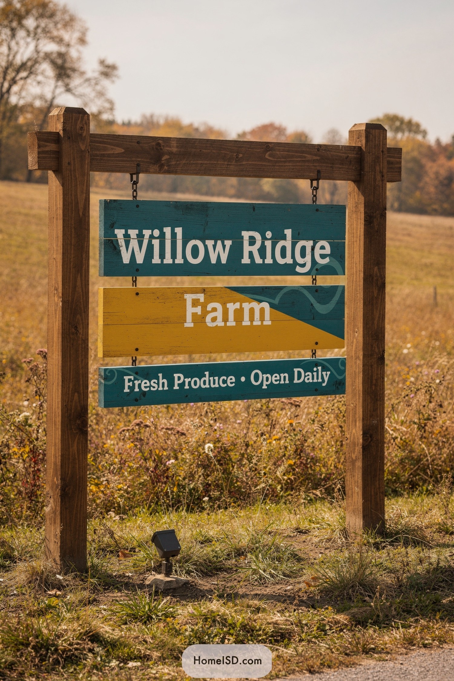
This sign leans into a relaxed, handcrafted look, with sturdy timber posts framing three suspended painted planks. The warm wood grain plays nicely against the teal and mustard panels, giving that “yes, we’re rustic, but we also know what a paint swatch is” vibe.
Bold, easy-to-read typography in crisp white keeps the message clear for passing drivers, while the layered colors and gentle wave graphic add a subtle nod to rolling fields and country roads. It feels inspired by vintage roadside ads and classic produce stands, reimagined with cleaner lines and a fresher palette so it looks timeless instead of old.
Whimsical Tractor Pasture Portal Sign
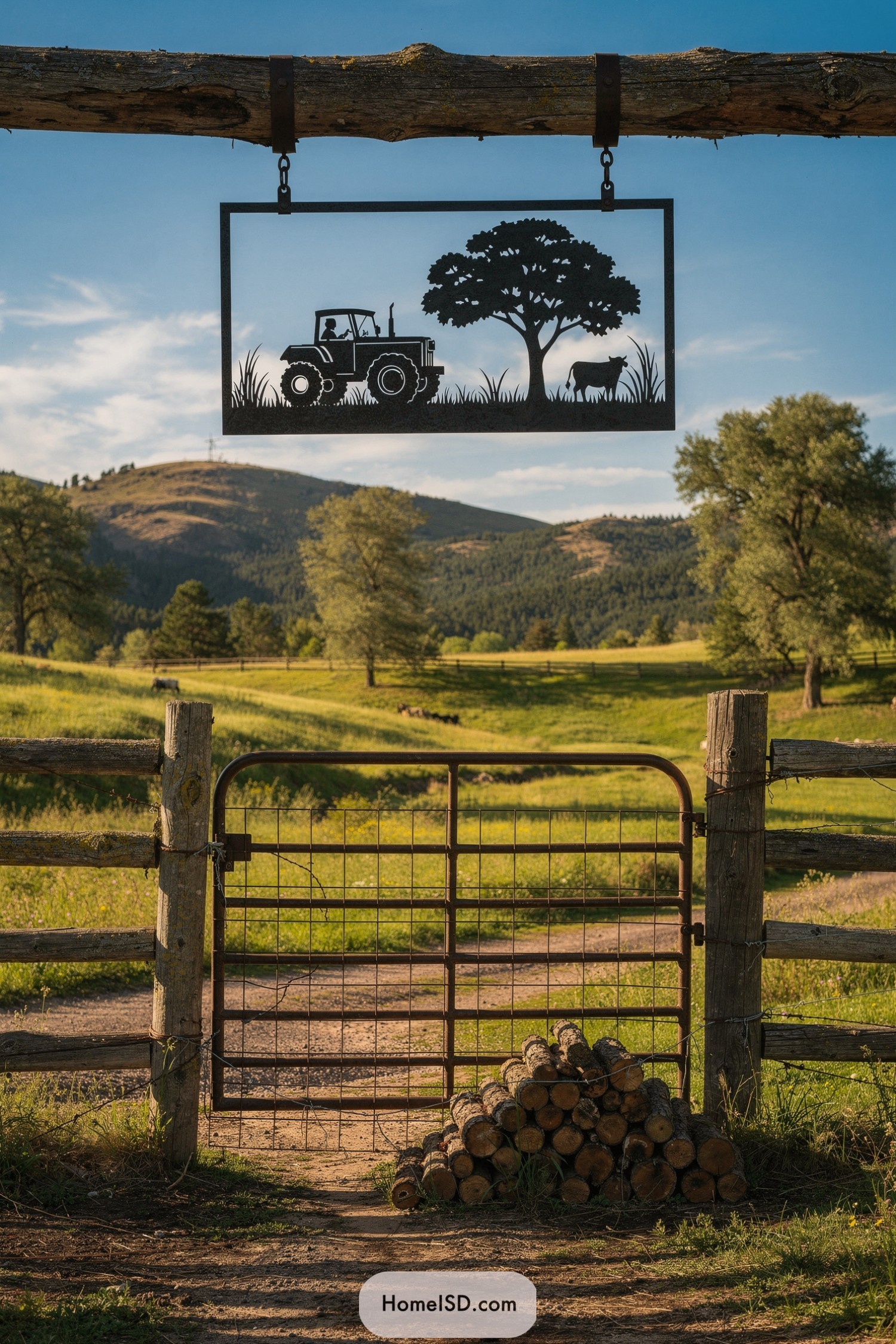
This hanging sign uses a crisp black metal silhouette to sketch a tiny farm story: a tractor rolling past tall grass toward a grazing cow beneath a full, leafy tree. The clean rectangular frame and fine cutout details feel almost like a hand-drawn illustration frozen in steel.
Suspended from a rugged timber beam, the slim profile keeps the design airy so the real landscape becomes its backdrop, almost like live-action artwork. It blends classic ranch practicality with a playful nod to nostalgia, proving you can mark an entrance and still make people smile before they’ve even hit the driveway.
Layered Barnyard Storyline Entrance Sign
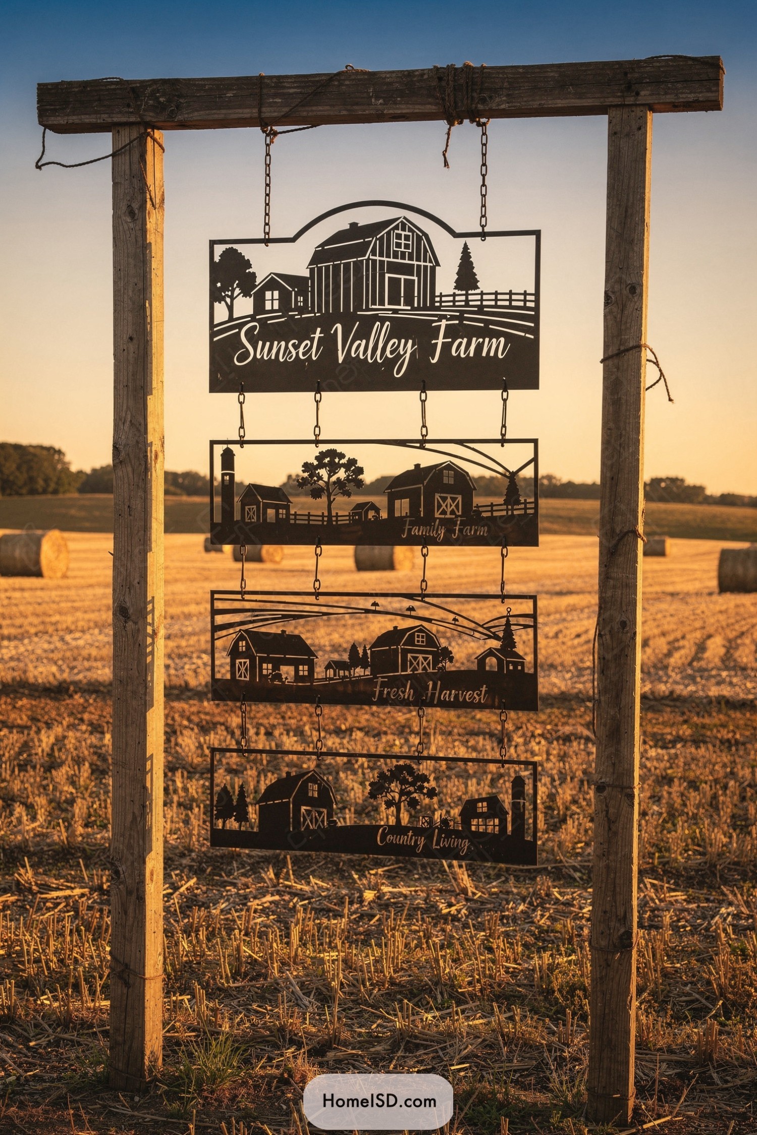
This layered farm sign plays with silhouette and negative space, letting the warm evening sky act as its backdrop color palette. Each metal panel tells a little scene of barn, fields, and trees, strung together on simple chains that add just enough movement when the wind decides to get artsy.
The rough-hewn timber frame feels deliberately unpolished, giving a “built by hand on a Saturday” charm that suits the pastoral setting perfectly. Script lettering softens the strong rectangular forms, creating a romantic, storybook vibe that makes the whole piece feel like the opening credits to life on the farm.
Rustic Beamway Lantern Farm Sign
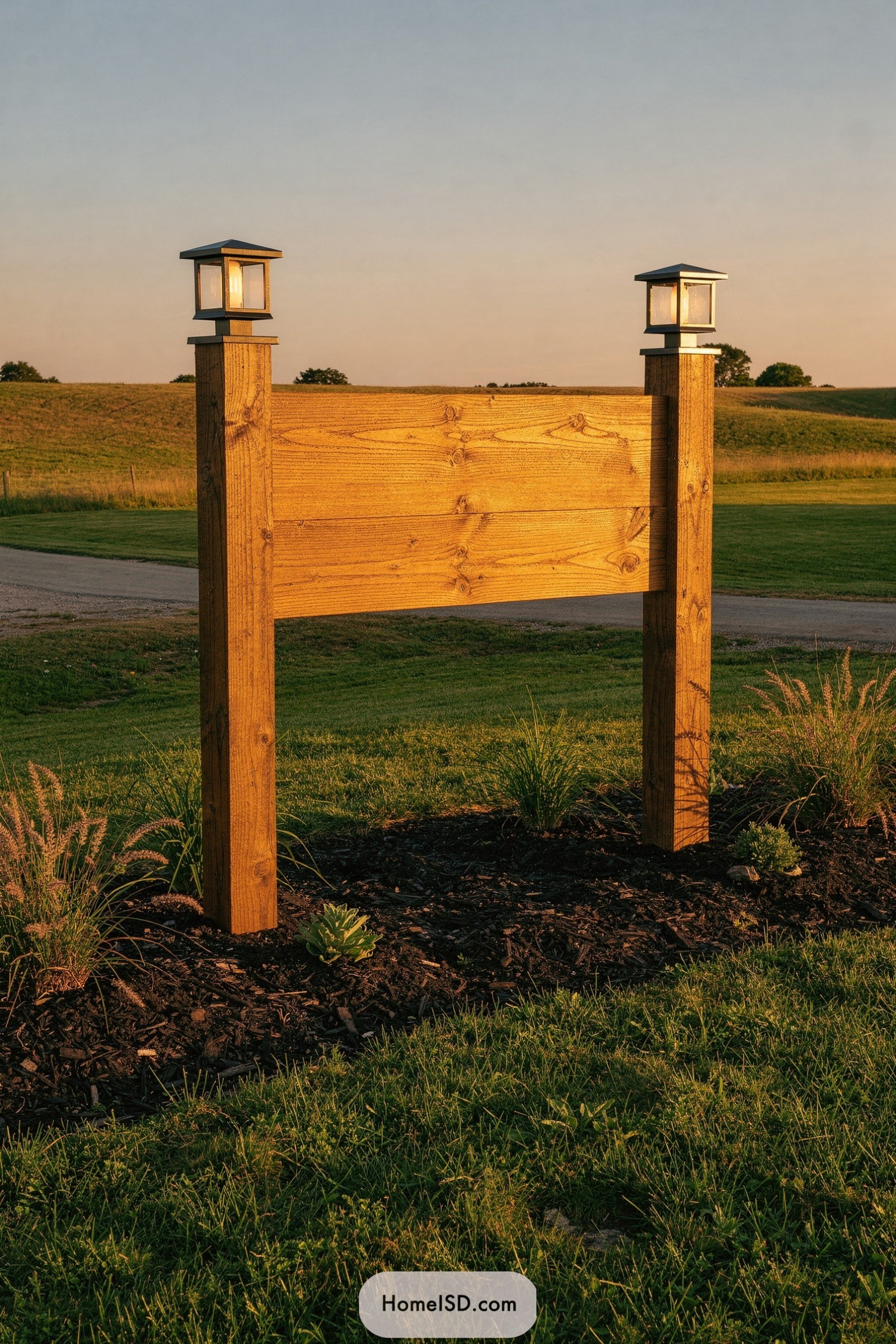
This sign leans into simple geometry: two solid posts framing wide horizontal planks, all washed in a warm, honey-toned stain that shows off the grain. The lantern caps echo classic Craftsman lighting, adding a soft architectural touch that makes the structure feel more like an entry feature than just a nameboard.
The clean, unlettered panel creates a generous canvas for a farm name or logo while keeping the overall look refreshingly uncluttered. Low plantings and dark mulch at the base ground the tall timber frame, giving it a landscaped, finished feel that says “we planned this” rather than “we just stuck boards in the ground.”
Countryside Cameo Hanging Farm Plaque
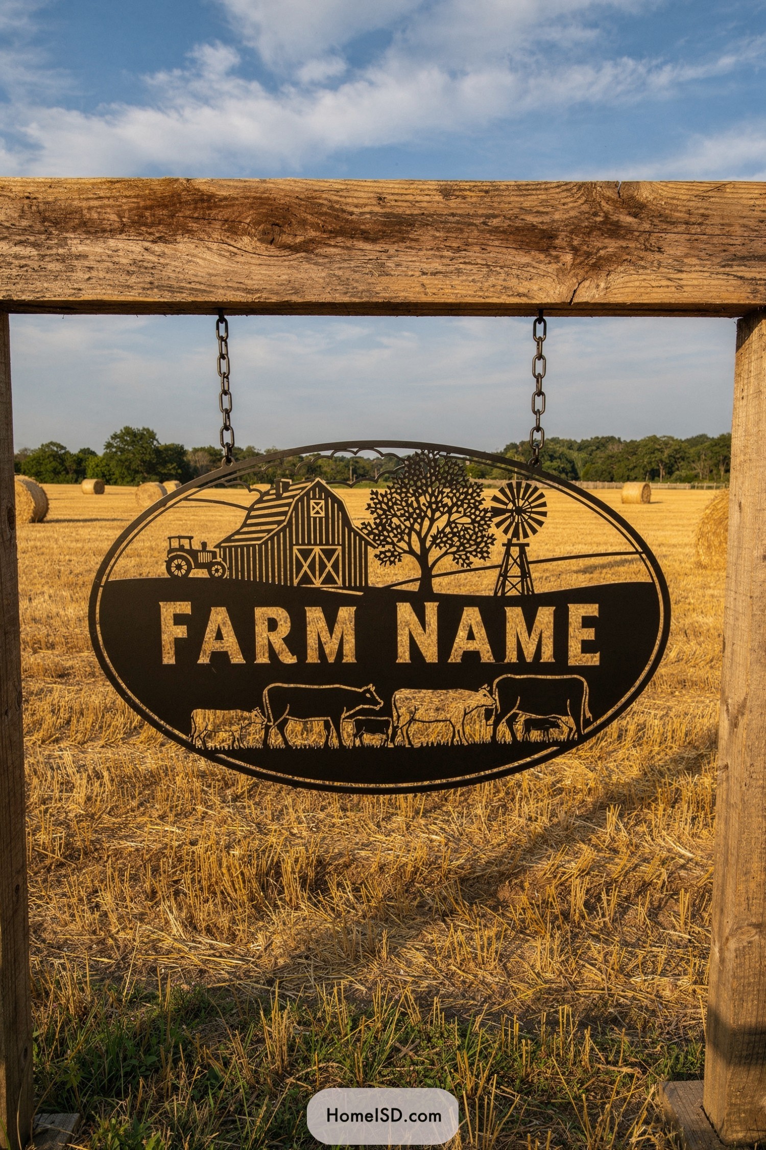
This farm plaque uses a clean oval silhouette to frame a tiny storybook countryside, from the barn and tractor to the windmill and grazing cattle. The black metal cutout pops dramatically against the golden stubble field, almost like a shadow drawing sketched right onto the landscape.
The hanging chains and rough-hewn timber posts give it a relaxed, working-farm feel rather than a fussy showpiece, which suits the scene of contented cows on pasture. It’s clearly inspired by classic Americana barn art, but streamlined into a bold, graphic statement that says “we’re practical people” while still showing off just a little.
Windworn Prairie Archway Name Sign
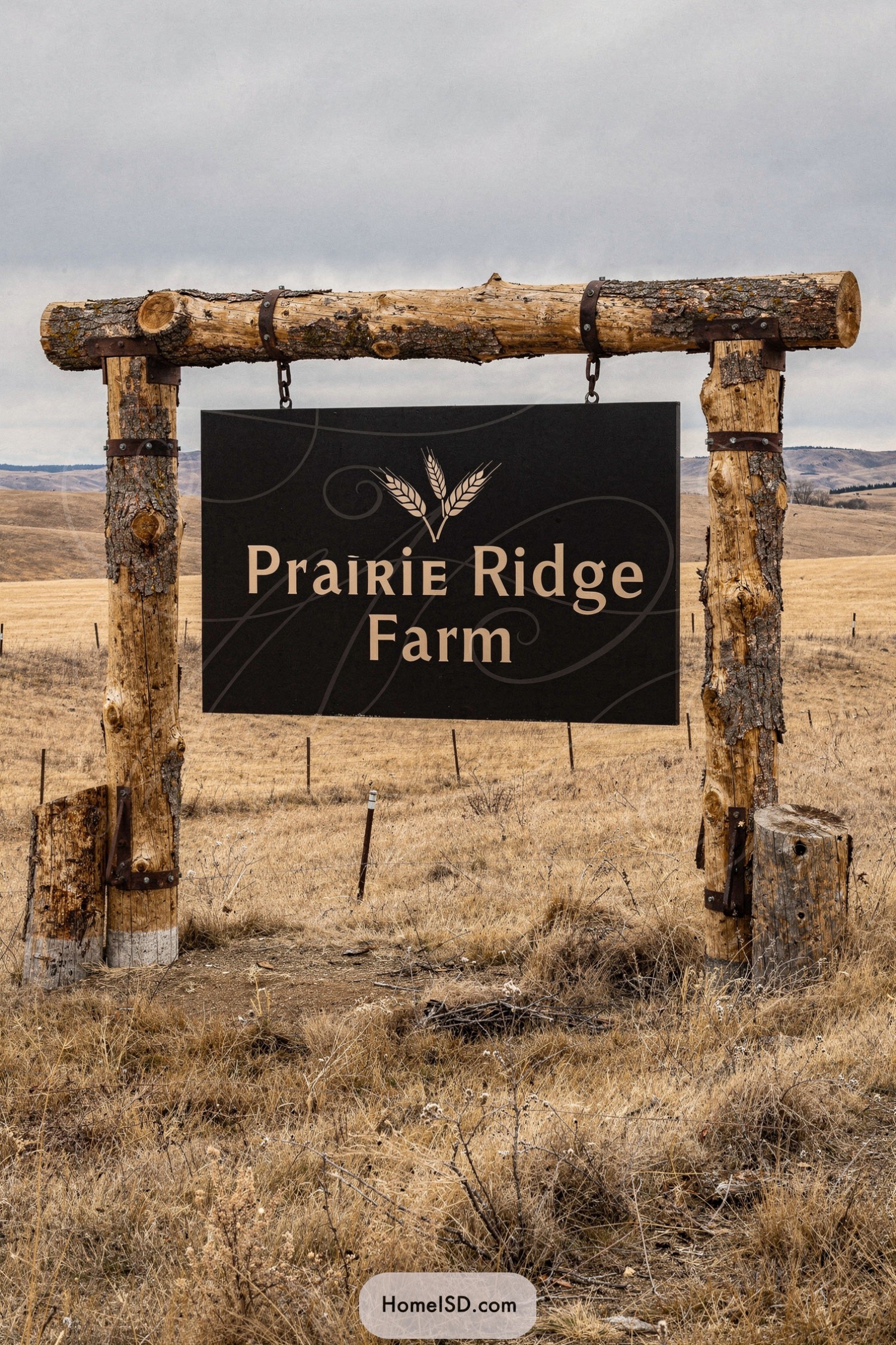
The sign pairs a clean, charcoal-black panel with warm, textured log posts, creating that satisfying contrast between polished and rugged that designers secretly live for. Metal straps and chains feel intentionally industrial, giving the piece a sturdy, ranch-gate honesty rather than a fussy decorative look.
Those hefty vertical logs and the simple crossbeam echo old frontier fence lines, clearly inspired by windswept prairies and big-sky landscapes. The wheat graphic and serif lettering soften the structure just enough, adding a touch of refinement that says “welcome” without ever trying to look like a country club.
Timber Horizon Cutout Farm Gateway
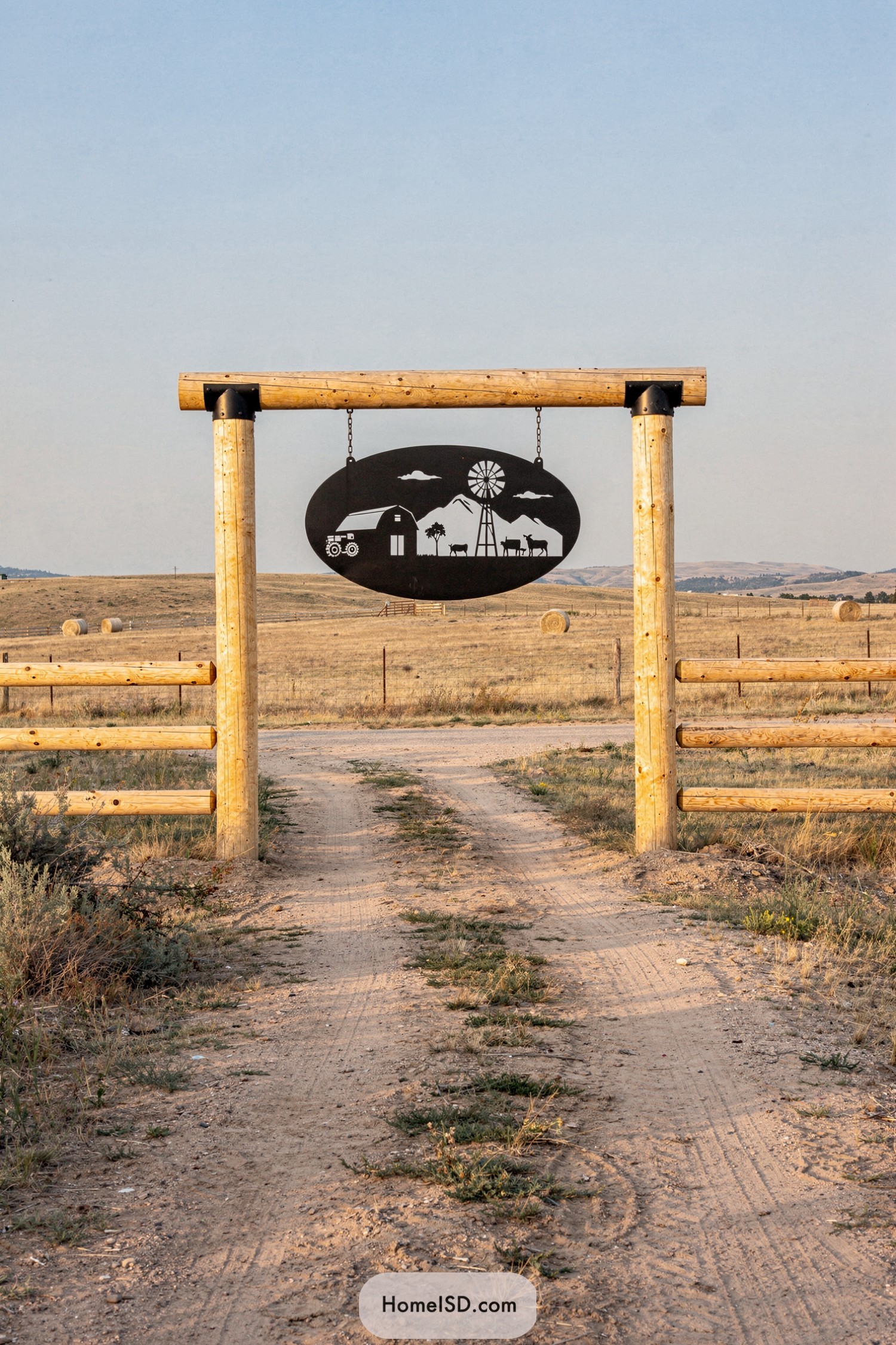
This gateway leans into a clean, rustic look with its chunky peeled-log posts framing a single, dramatic focal point: the black oval cutout. The metal panel captures a tiny story of farm life—barn, tractor, windmill, and livestock—laid out in crisp silhouettes that pop sharply against the open sky.
The contrast between the warm, sunbleached timber and the dark, graphic sign keeps the whole piece feeling both traditional and surprisingly modern. It’s the kind of entrance that suggests the owners appreciate craftsmanship and a bit of whimsy—because if your driveway starts with its own landscape artwork, expectations for the rest of the property go up in the best way.
Sunset Silhouette Ranch Gate Placard
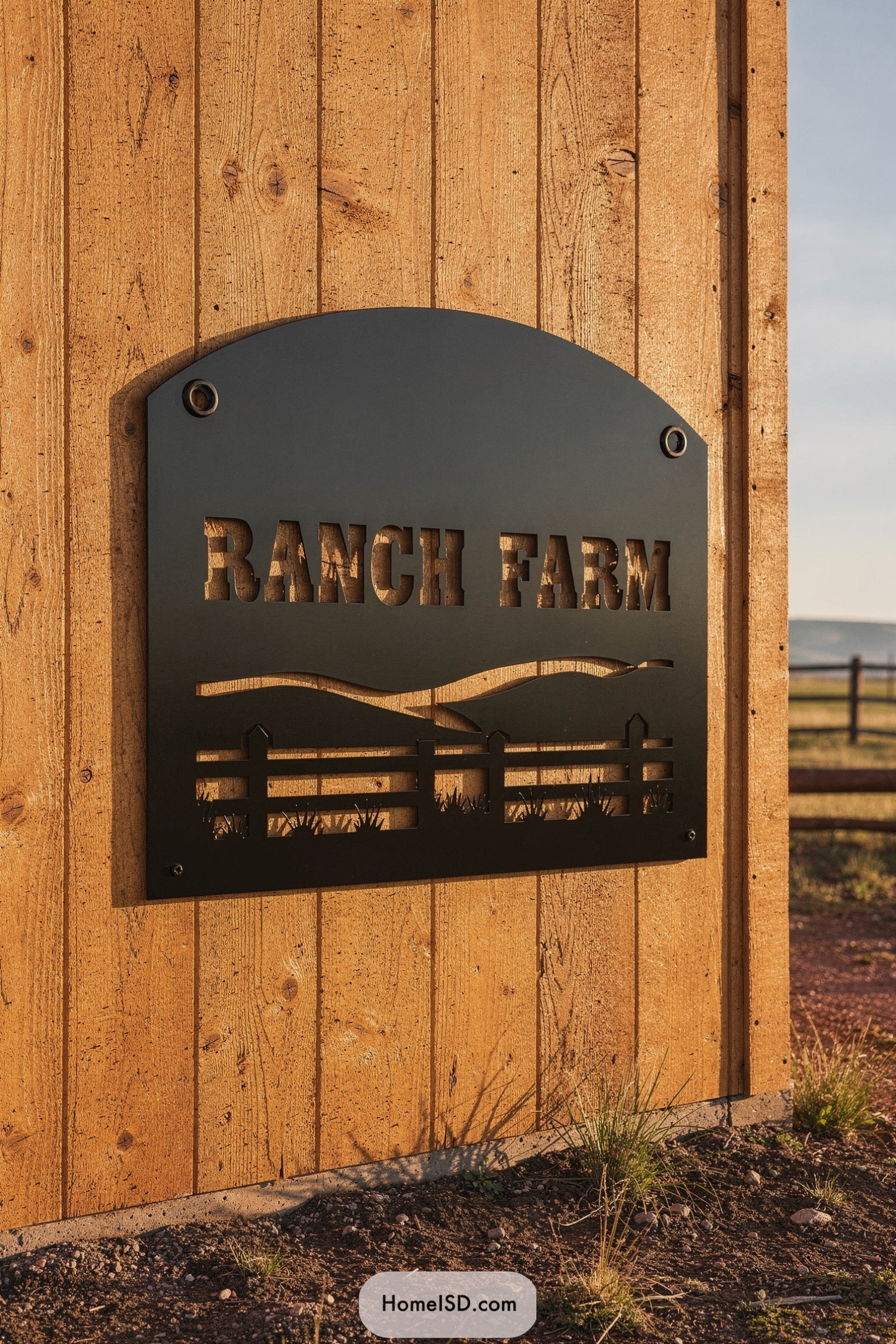
This ranch sign leans into clean, modern metalwork while still feeling right at home on the weathered wood siding. The arched top softens the bold rectangle, so it looks intentional and tailored rather than just “a big metal sheet on the barn.”
Laser-cut lettering and the hillside-and-fence scene let warm light shine through, turning the sign into a graphic silhouette as the sun moves—almost like the landscape is changing with the day. The crisp black finish contrasts beautifully with the honey-toned boards, giving a polished, designer touch that still says, “Yes, there’s real dirt and real work happening here.”
Pin this for later:
Recap

