Last updated on
When designing and decorating a kitchen, does all kitchenware have to match in color? The short answer is no. Read on to find out the best color schemes for it.
The kitchen, as they say, is often the heart of the home. And the center of your home does not have to all be shades of the same color!
Gone are the days of gray, black, and white. Color is back in the kitchen. And what better place to show off splashes of color accents than in your kitchenware?
Your appliances, pots, pans, utensils, dishes, and cookware all play a role in brightening up your kitchen. Let’s take a look at how to use color to liven up your kitchen, and therefore your food prep, meals, and gatherings.
We’ll look at different color combinations, and how you can use these when selecting your kitchenware.
The brilliant thing is that the more neutral your kitchen colors (black, white, gray, wood, stainless steel), the more you can go crazy with different color schemes.
The Power of Contrast
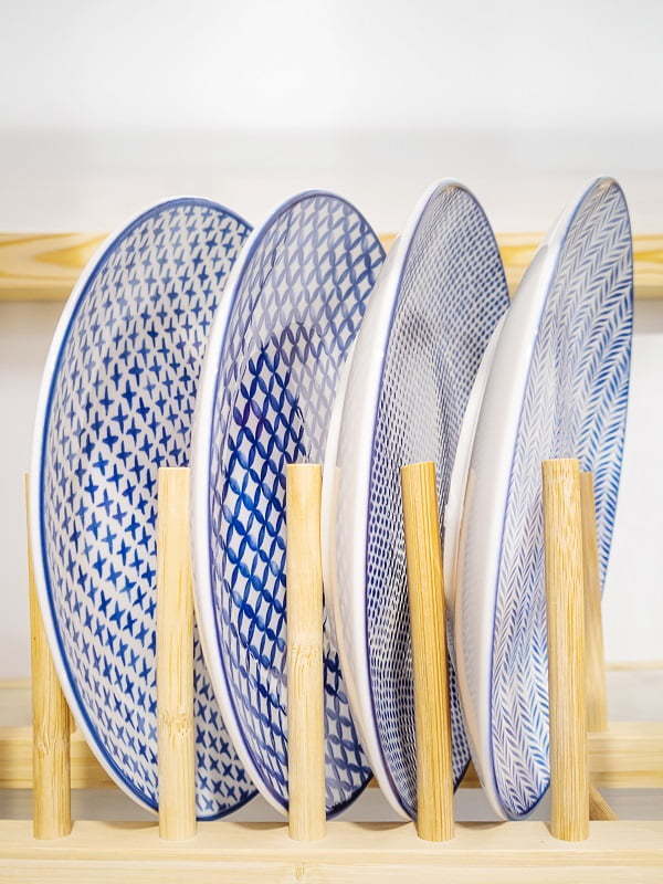
Rather than selecting different shades of cream, white, or gray, contrasting colors can instantly brighten up your kitchen.
The strongest contrasting colors are those which are complementary to each other. If you look at colors on a color wheel, the colors opposite each other are complementary colors. When these colors are put together, they each make the other look brighter.
For example, on the standard color wheel, red is the opposite sky blue, yellow is opposite navy blue, and pink is the opposite light green. You can see more about color wheels here.
Translating this look into your kitchenware
To bring contrasting colors into your kitchenware, you could have yellow and blue dishes. Or yellow dishes, and blue handled silverware. Or eggplant-colored pots and pans on a streaked gray marble countertop, with several containers of green herbs.
Aim for no more than two contrasting colors in your kitchenware, with perhaps small touches of a third color. For example, peach pink dishes with deep aqua blue cookware or silverware handles of deep blue. Then add a light blue vase, or hand towels, or a sky blue kettle. The sky’s the limit 🙂
The Magic of a Monochromatic Color Scheme
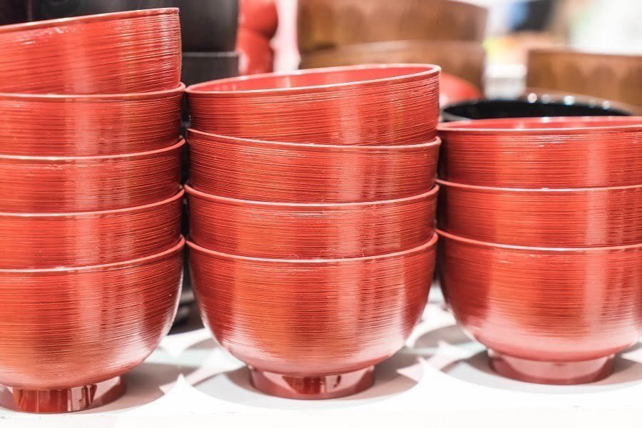
If you are someone who appreciates a calming atmosphere in your kitchen, you may want to opt for a monochromatic color scheme for your kitchenware.
A monochromatic color scheme is one in which you use a variety of shades of one color. For instance, three shades of burnt orange. You could have a dark, medium, and light shade.
Translating this look into your kitchenware
To bring this look into your kitchen, you could have light orange napkins, medium orange utensils, and dark orange cookware. There are lots of possibilities for colorful cookware. From cast-iron pots to tagine pots, there are many choices. You can see some beautifully colored cookware examples that are an example of the perfect deep red color here (visit website).
Shades of avocado green is another example of a monochrome color scheme that can look classy and restful. You can have light green tiles with dark green appliances, cookware, utensils, or stools. Then add some medium green dishes, and you’ve got yourself a peaceful color combination that is subtle yet powerful.
An Analogous Color Scheme
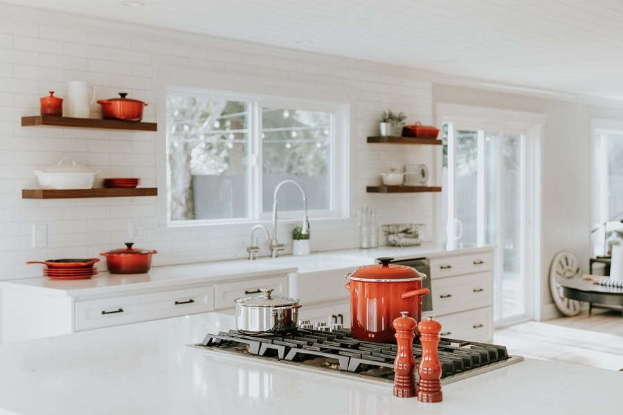
Another option is to choose three colors that sit beside each other on the color wheel. If used in equal parts, these colors can be overwhelming. However, by selecting one color as the primary color and the other two as accents, you can achieve a bright and modern look without overkill.
Translating this look into your kitchenware
To bring this color scheme into your kitchen, try the primary color, such as a deep yellow, for your dishes, pots and pans, and cutlery. Then choose selected pieces of lime green and orange for accents for smaller pieces, such as kitchen towels, a vase, a kettle, or other appliances.
A Triadic Color Scheme
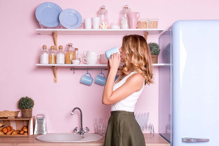
If you really like color contrasts, a triadic color scheme uses three colors that are evenly spaced on the color wheel. This combination makes for very bright colors, so you may want to use pastel colors, or one principal color and have the other two colors as accents.
Translating this look into your kitchenware
For example, yellow, pink, and light blue makes a triadic color scheme. You could use light blue as your main color for your dishes and cutlery, and then bring in accents of yellow and pink with appliances, pots, and pans. Or you could have light blue and pink together for your dishes and cutlery, and then yellow appliances. Lots of possibilities!
Warm Versus Cool Colors
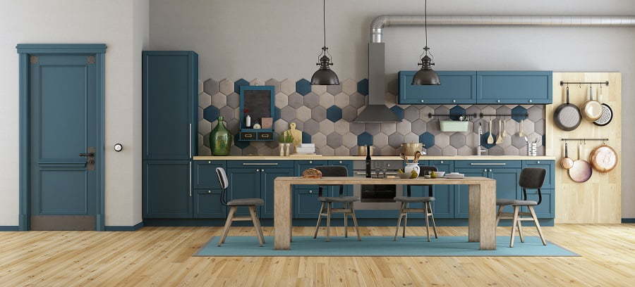
Depending on personal preference, you may want to prioritize either warm or cool colors.
Warm colors on the color wheel are from yellow to orange, red, pink, and violet. Warm colors have, as you would expect, a warming effect on us. They make us think of the sun, of warmth. Warm colors tend to bring a feeling of coziness and energy.
Cool colors on the color wheel are from light green to dark green to light blue to dark blue to purple. Cool colors make us think of water, of coolness. Cool colors tend to bring a feeling of serenity and calm.
Color psychology is an entire subject in itself!
Other Colorful Kitchenware Items
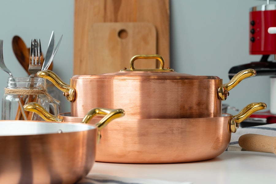
Here are some ideas for additional kitchenware items that can add a splash of color:
- Ceramic knives. These knives come in many different colors and are fantastic tools to have in any kitchen
- Cast-iron pots and pans. There are many beautiful choices of color, and cast iron is excellent for cooking
- Tagine pots. These can be very simple, or very colorful
- Ceramic teapots
- Egg cups
- Small dishes for dips, sauces, etc.
- Ceramic bowls (think large fruit bowl)
- Copper cookware
- Ceramic pots for sugar, flour, garlic, etc.
Final Considerations
One final thing to decide is which overall style of kitchenware appeals to you.
Do you prefer soft curves? Straight, sharp edges? What overall look do you like? Avant-garde? Traditional? Farmhouse?
There are as many kitchenware styles as there are types of kitchens, so don’t limit yourself by feeling that everything has to match. Hopefully, now you see that you really can experiment with color and achieve fabulous results.
Recap
