Last updated on
Here are 17 ideas on how you can decorate your walls with posters and art prints. Use these for inspiration to come up with your own collections.
Just because your walls are empty doesn’t mean they have to be boring. In fact, a blank wall can actually make a room feel more spacious. Whether you prefer cool, calming colors or bold pops of color, there are many ways to decorate your walls with posters and prints.
The first thing to keep in mind is that you don’t necessarily need to frame your posters and prints. In fact, you don’t even need to use nails or tacks. A simple strip of tape can keep a poster in place, and because you can pull it up and move it around whenever you like, you can experiment with different display options.
You can hang a poster in every room of the house. For example, you might hang posters in your bedroom because it’s a space that you can decorate with your own personal style. Also, posters on kitchen walls make cooking more fun and easier by framing photographs that may include food or drinks. These and more ideas are coming next.
The examples of the following ideas are all from Fine Art America.
Pick the Right Place
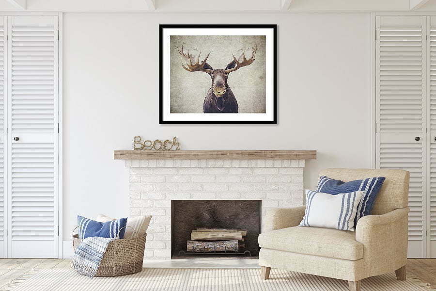
In general, homeowners most often hang their posters above fireplaces or sofas and around credenzas, but this is not a definitive decision. You can also decorate shelves or window sills with a poster that will harmonize with your modern interior.
It would help if you also considered height because you want to hang them neither too low nor too high. The rule for hanging wall decorations that specialists recommend is to put it in your sightline, highlighting the poster even more when guests are over.
Lastly, if one wants to make their ornament stand out, they can install LED lighting, which will light up the poster and draw attention wherever people present.
Choose a Theme
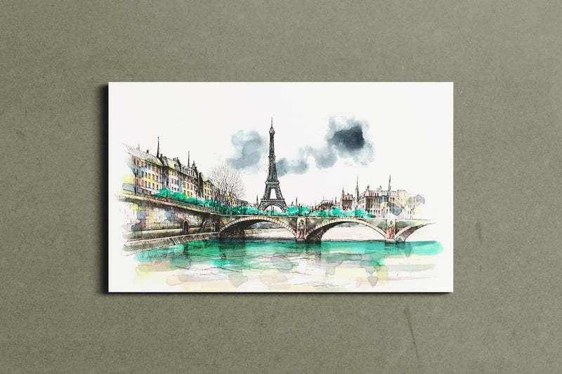
By experimenting with different hanging posters, you can build a theme that will reflect your personality and make your home harmonious. For example, if you have posters that show all the places you’ve been to, you can create a theme by displaying them in the order of when you traveled that place.
Creative arrangements are possible for this wall display – such as arranging them symmetrically in a grid where each poster is just as big and rectangular-shaped or placing them in vertical columns going from top to bottom if there is a narrower room in your house.
You could also create an asymmetrical layout for more unusual art textures on your walls by connecting two empty walls with artwork hanging from one corner of each wall or combining pictures side-by-side with the same effect but different sizes; these options do not need to be symmetrical because it would mainly show off variation for how they look closer up and further away. You could experiment with different approaches to reflect who you are individually and what aesthetic strategy matches your personality.
Choose Your Frame Style
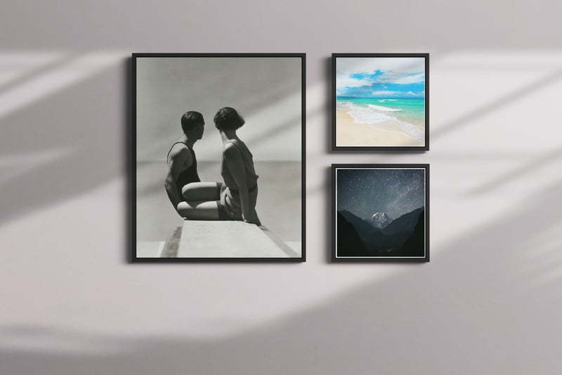
Dimensions for a frame: framing is an important style element that can make or break the look of your art, posters, and wall decor. Frames add depth to the artwork as well as balance. Modern frames come in a wide variety, from traditional wood to modern acrylic.
For more vintage-looking artwork, you can either go with museum glass or distressed metal, which are heavy, so beware if adding heavier framed walls above floorboards could risk them giving away and causing potential damage.
Keep it light with modern styled art when using newer brackets like wire mesh and plastic. Brackets are no longer bolted down into place but instead become just another part of the design element, not something used solely for holding up weighty frames.
Using too many different styles risks ruining the ultimate effect when everything comes together on whole wall gallery display pieces by having each piece belonging to an entirely different theme. Remember, you don’t have to use a frame at all — there’s always your poster rails saved, especially for this kind of project makeup.
Coordinate Colors
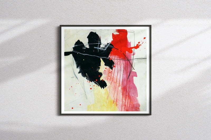
Many people prefer to post images on their walls because they offer a neat and clean method for adding colors to your home decor. Thousands of posters are sold every year, making it easy for the average person to find just the right piece if they want something specific or need a color-coordinated design. It doesn’t matter what age you are or what style you’re going for–there’s always something that will work best with the current room layout.
However, before purchasing posters, check paint chip samples against any new purchase before buying anything costly if there’s a color-matching mix-up along the way.
Posters in the Living Room
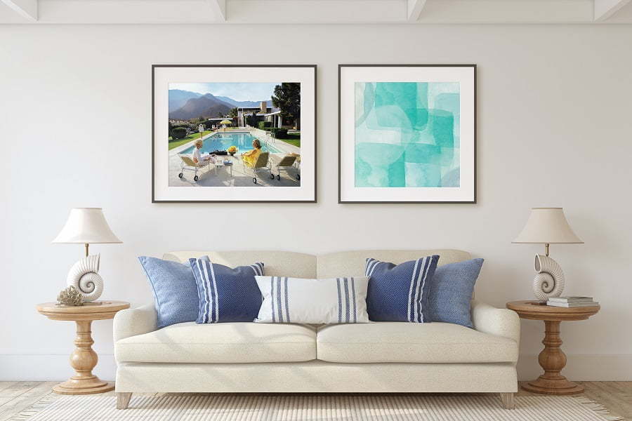
Posters are an easy and exciting way to decorate your living room. Try propping your poster on the floor instead of hanging it up on a wall! It will give you the feeling of being more casual, and it’s easier to change out posters when you want—frame different sizes of the same kind of artwork near each other. For example, hang a North design and a mountain summit theme near each other for a cozy atmosphere in all rooms.
Posters and Prints in the Bedroom
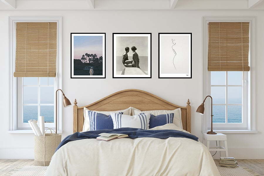
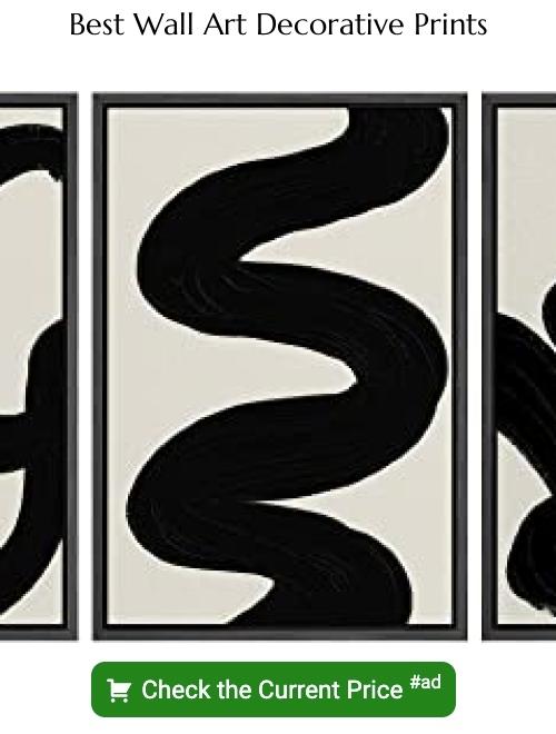
A design for an easy-on-the-face poster is going abstract as a minimalist. But one must choose the appropriate wall art decoration for this spot, as it can be quite difficult and treacherous to decide on a suitable design.
Gallery Wall
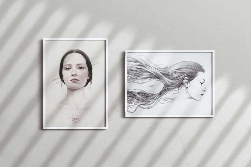
Your walls will be less boring to look at by doing the following. Decide which aspect of your wall art you want to choose, such as a favorite person or family photo, where you think it would work best on your wall.
Next is choosing how to frame these little pieces and design what size they will be, and create a story with them.
Posters on the Dining Room Wall
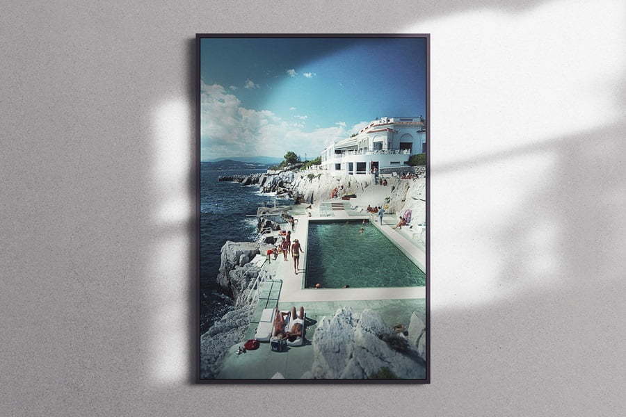
An art piece in the dining room with an appropriate frame can help to create a more pleasant environment for mealtimes. Contrary to other house rooms, where it is actually used often, wall décor needs are pretty universal. A large framed poster and its frame can be a great starter.
Posters and Prints in the Family Room
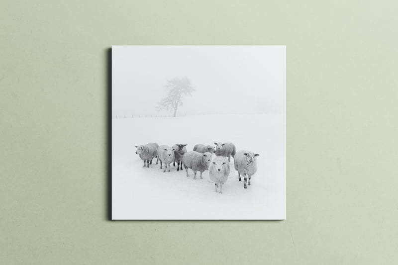
Custom panels are a great way to customize your posters. A panel is a sheet of paper glued to a frame that you can obtain from many stores, and certain ones can even put customized panels together for you. The family room usually has several decorations hung up or placed on shelves and tables in the room. There are posters that one can decorate with, creating an entirely different atmosphere to the place. You do not need to know how to draw if you want your posters personalized.
Posters in the Bathroom
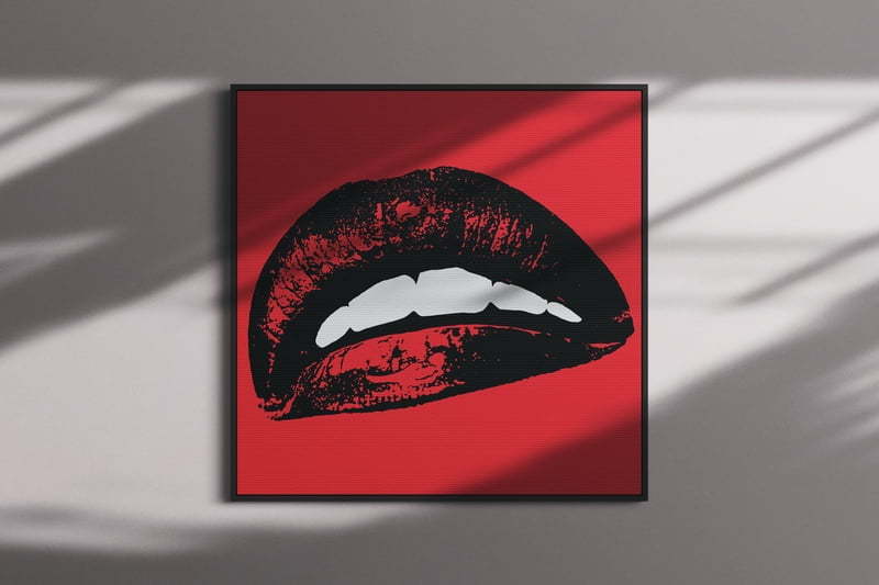
People tend to think that the bathroom doesn’t need much decoration. While it may not necessarily be as visible as the other rooms in your home, there are many ways to add decorations to your bathroom wall without competing with other design elements. A popular way is through framed posters and art framing, which offers a creative opportunity for you.
Size Matters
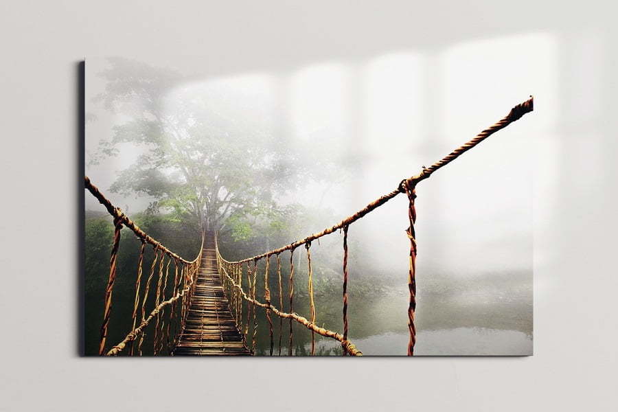
It’s common for someone who is purchasing artwork to underestimate the size that they think is necessary. In most cases, if you are decorating a large space, the next size poster or print should really be purchased in order to make an impression in large spaces.
The size someone may think they might seem big at first, but from a few feet away, statuesque people won’t notice every detail of the picture, especially because it will sometimes appear smaller than its actual size.
Pick a Couple of Colors
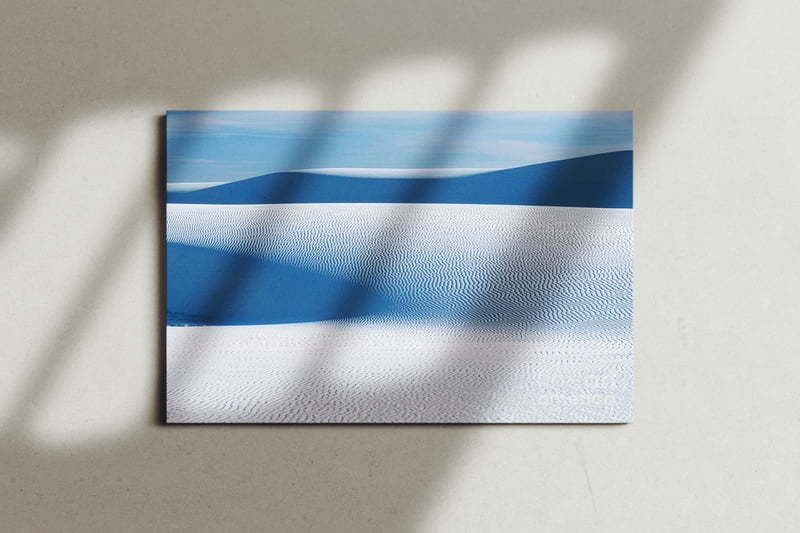
If you want to pull the look of your entire room together, start by thinking of the color scheme that you would like to use in your room. Find a few good colors from one piece of artwork or from different pieces of artwork, as this can provide different suggestions for color themes which may be easy on your part; being that most people are not skilled at matching colors and often times break up their spaces due to clashes in theme.
Focus on Color
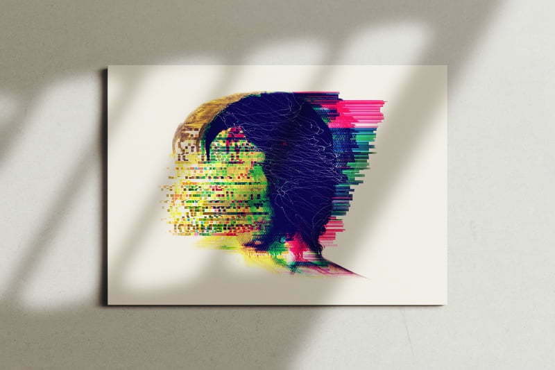
A good way to get it right and make it complement the mood is to choose items that work with the color of the painting. To define what makes us who we are, basically our identity, it’s important to understand things like: people in new surroundings tend not to stay long unless they carve out their own space.
Sense of the Unfinished Art
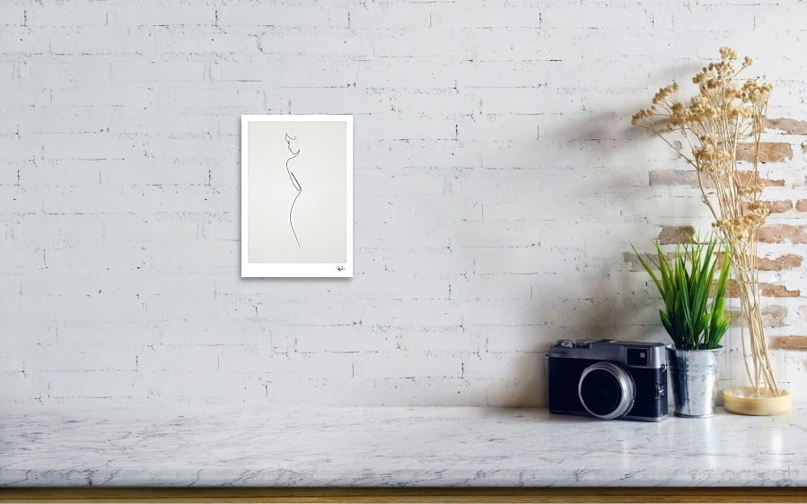
According to postmodern decorators, a sense of unfinishedness is now considered chic. Many decorators leave the pictures either off the walls, or they place them on the floor or hang them in such a way that they are put up temporarily. This preserves any scratches inflicted to the walls from the long-term design but shows your latest mood as well as reflects new trends and inspirations which you picked up while looking at artwork studios.
Balance and Harmony
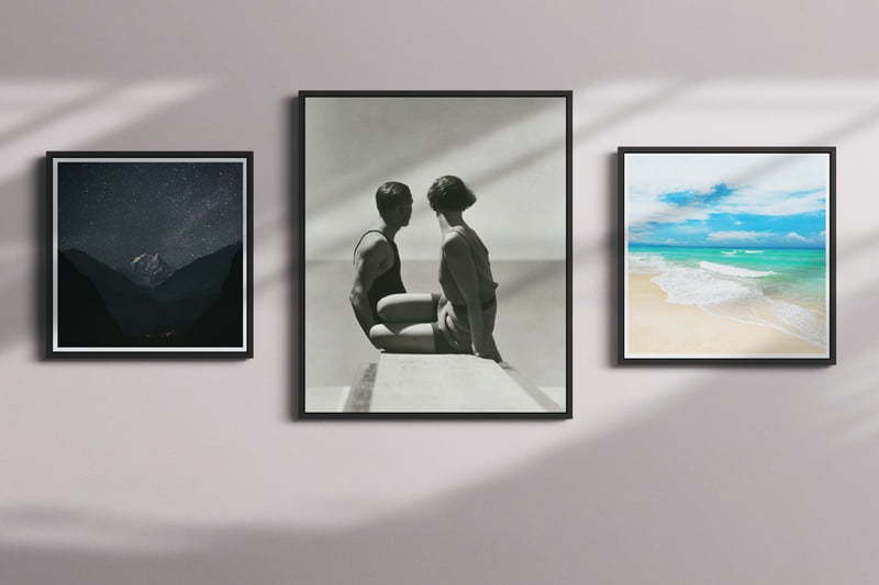
You can arrange various posters together to resemble a gallery wall. This will create continuity and flow between different posters, since grouping similar objects together is known as a popular design trick. Placing the same frames on your posters will unite them on the gallery wall, creating one fluid display of art that will make your walls much more crisp.
You have the option of either using a single theme such as maps for all of the prints, or you can use prints with two-three different themes if you prefer cohesiveness but want less repetition in your gallery walls. If you have low ceilings and limited space, use three prints grouped in one row to maximize vertical coverage while still utilizing minimal floor space.
Symmetry and Asymmetry
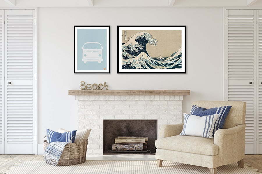
If the tension and drama is not desired, symmetrically arranging posters around one central point can add stability to a room. However, if energy and dynamism are more important than stability for aesthetic purposes, asymmetric arrangements of posters can be used as well.
Correcting the Room’s Flaws
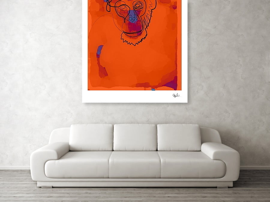
If you have a space that looks too bland, you can decorate the walls with pictures to visually create zones within the room. The images should be placed vertically if you want to increase height and horizontally if you want to widen it. Additionally, black and white paintings of an asymmetric order look good in an office environment without distracting from your work.
Recap
